Logos & Catchphrases
From the very first, CandL has been very enthusiastic about designing logos and inventing special names for the business and its products.
The partnership, which in its early days advertised as “Woodworkers, Electrical and General Engineers”, named the bedwarmer they made in their St Andrewgate workshop “Coseytoze". It consisted of a metal cylinder with turned wood ends and contained a carbon filament lamp as a heater. It had a chintzy cover made by Regge’s mother. The York Electricity Department bought some for selling to their customers.
One of the first radio kits they sold went under the name of “Himashas Three” to indicate that it was a three valve wireless set. You could buy it made up or as a kit and if you hadn’t the facilities at home to make it then for 5sh (25p) you could make use of CandL’s workshop and tools.
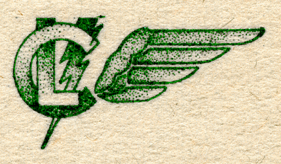
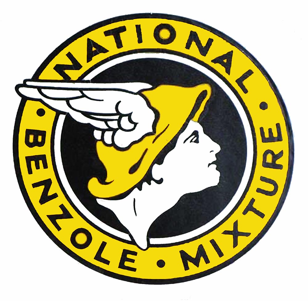
The first company logo (shown left) appeared around 1930 and it was still in use on letterheads in the late fifties, although it had changed colour several times. It was based on the 'National Benzole' logo shown below.
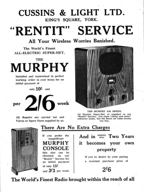
“Rentit” was a scheme launched in 1935 and continued until 1938 whereby you could rent your wireless, but had the option to buy it after 2 years for the sum of 2s 6d. The set was maintained free of charge for the whole period of the contract.

The phrase “the Electrical Home Makers” was coined when CandL expanded into electrical appliances. It first appeared in 1936 on a large sign on the King’s Square shop (above).
“Inclusive Radio” was a scheme launched in 1938 to supersede “Rentit”. On this scheme an outdoor aerial (the CandL Allwave) was also provided. Initial payment was 10sh (50p) followed by 104 of 2/6d (12½p) for a Murphy A46 table radio. At the top end of the range a Murphy A46RG radiogram set you back the same 10sh deposit followed by 110 payments of 5s (25p).
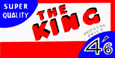
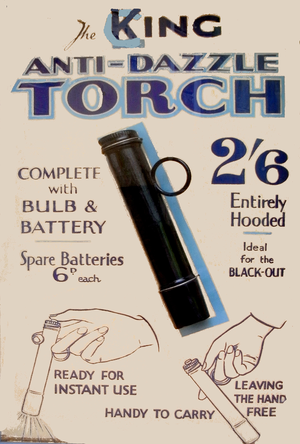
 In the late thirties CandL began using the brand name “King” for some exclusive products they were marketing, such as vacuum cleaners and batteries. The name was also used for the torches CandL manufactured during World War II (see below).
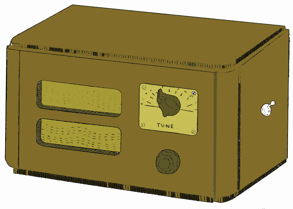
 “Mighty Atom” was a very appropriate name for the two valve radio sold in kit form during this same period. Initially it was sold in chassis form as a medium wave battery powered radio. Then Regge sourced a small wooden cabinet for it. Later still long wave was added. Finally an optional mains unit kit was designed for it. Thousands were made and the armed forces loved it. For the high tension supply they used discarded HT (high tension) batteries from their military radios. For the 2 volt valve heater supply they clipped onto one cell of their vehicle’s battery. CandL had letters from all over the world singing the praises of the Mighty Atom.
For the technically minded it was a TRF (tuned radio frequency) regenerative (it had positive feedback almost to the point of instability to increase sensitivity) receiver.

‘Ren-Tel’ was the name of the company formed in 1953 to manufacture TV sets to be rented out by CandL. The name was subsequently used on a whole series of items which the group produced or marketed.
In 1959 CandL completed an extensive updating and enlargement of their King’s Square store. This prompted a new logo, with variants, featuring the new look store.
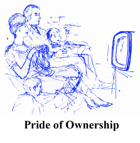
“Pride of Ownership” was a scheme launched in 1960. Essentially it was a 30 month hire purchase agreement which included full maintenance of the item by CandL. It was a huge success and was still going string a decade later
Cussins and Light is quite a mouthful and for many years staff had always referred to it as CandL. This is very close to candle which leads on nicely to light. Cue for logo! Sounds obvious but it was 1965 before it happened. It was soon incorporated into letterheads, adverts and on vans.
In 1967/8 CandL took over the prime electrical businesses in Scarborough, Whitby and Selby. All three were well respected businesses and CandL were anxious to retain the loyalty of their customers.
As part of the plan they incorporated iconic local landmarks in the logos of these businesses. Thus Barratt of Whitby and Gotch of Selby had their abbeys (albeit one a ruin) whilst Goods of Scarborough had its castle, lighthouse and harbour.
The refurbishment of manufacturer’s returned stock began in 1980. Three years later it had become big business and so it was decided to devote Walmgate shop to the sale of these goods.
Some catchphrases were required to capture the public’s attention. In a city with historically very close involvement with the railways, what better description for the products than “First Class Returns”. And for the shop selling them “Your Friend in the Trade”, inferring some special inside connection who would do you a good deal.
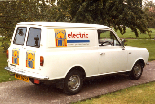

By 1981 CandL were confident that they had established the CandL name over the whole of North Yorkshire and as a consequence redesigned the van logo to a simple “CandL Electric”, which is about all the information the eyes can assimilate as a van whizzes past you.
1985 and time for an update of the CandL logo. On this occasion CandlL handed the makeover to students of York's Technical College. In collaboration with the college they held a competition, with four prizes, for the best new design. The winner was Ian Lucas and his design is shown above as applied to a van.
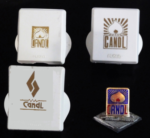
In addition to featuring their logo on stationery, vans, price tickets adverts, etc CandL also had it imprinted on 13A plug tops (see left), plastic bags, cufflinks, tie clips, ties and sweaters and etched on glass tankards. It continued in use after CandL became a property company as is shown in the 1990's letterhead below.

 After the split of CandL into Cussins & Light (1994) Ltd (wholly owned by the Cussins family) and Eborlight Ltd (wholly owned by the Light/Thompson families) Paul Cussins, the third generation, decided the new Cussins company should have a logo which, whilst acknowledging the past, separated it from the past. This is what he came up with.
 By 2009 work was virtually complete on the new headquarters in Terrington. It was time to celebrate with a new logo. The task of designing it was given to Chloe, a member of the fourth generation, and this is the design selected by her elders from the many she submitted to them.
PS
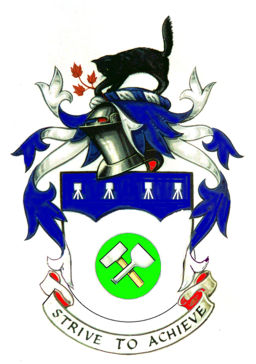
In 1998 Denys decided it would be fun to have a family Coat of Arms and the end result as registered at the College of Arms is shown below. The lower silver shape replicates the outline of Regge’s Assay Mark whilst the lump hammer and cold chisel are reminders of his father-in-law, Jack Hall, Master Builder and Stonemason. The three transistors along the top are there to represent Denys’s academic research of long ago.
The black cat above the shield is Rufus who for nearly twenty years was chief vermin-exterminator at Denys’ home.
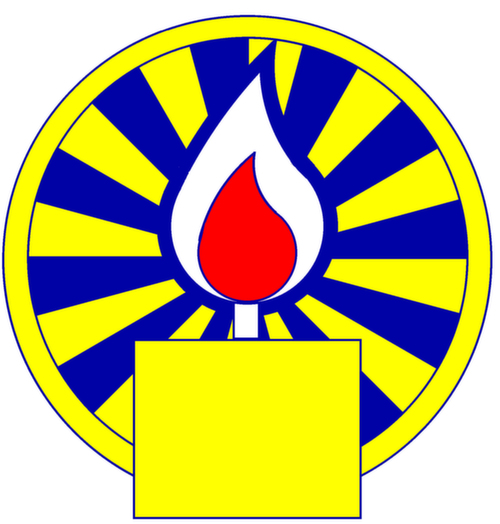
Denys thought the motto “Strive to Achieve” was original only to discover it was a phrase used by Regge in a CandL booklet over 60 years previously. The badge (also shown below - used historically to "mark retainers and identify small articles of private property" is very obviously based on a CandL logo. For the past few years Denys has had one on his car, replacing the maker's badge.
